Patient Profile Redesign
Helping care managers engage more effectively with patients
Team
Kejia and Nan (product management)
Irtiza (project dev lead) and the rest of the developers
Skills
UI/UX design
User research
Problem
Users often can't find much information about patients before contacting them.
The patient is the basic unit of most healthcare software. They're the people whose lives we're aiming to improve, yet care managers often come into these conversations with patients without sufficient context about their history, or they can't contact them at all.
Definitions
- The product: Pathways, an internal-facing care management application at Astrana Health.
- The users: Astrana Health care managers—a type of healthcare professional who coordinates a patient's care, ensuring they receive the appropriate medical and social support to improve their health outcomes.
When I initially designed the MVP of Pathways, I turned to our users to best understand what information they needed to see in a patient's profile. Astrana has an existing suite of software for other healthcare workers like case managers and doctors, so I was also able to study those apps to understand what info is typically included in a patient profile.
The first version showed them all the information they needed, but there was still a lot of room for improvement.

Design discovery
Turning to users to understand the problem
Over time, the patient profile grew more bloated as users kept requesting new fields, such as a section for Surgeries or Other Contacts. As we added more features to Pathways, the profile became more complex and hard to digest. We decided it was time to do a top-down redesign of the patient profile.
I sat down in a few 1:1 video calls with longtime Pathways users to understand why they used the patient profile and the pain points they experienced.
User interview takeaways
In my user research, I learned that to deliver effective care, a care manager needs two things from the patient's records:
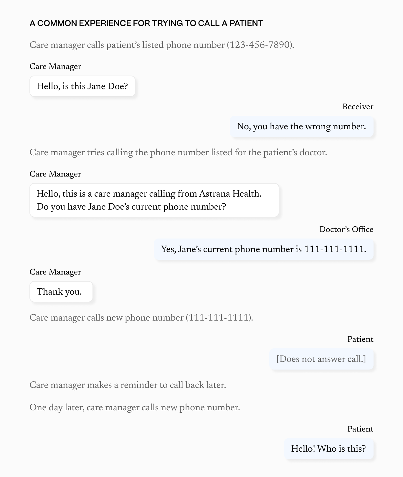
First, up-to-date, quality patient data is essential, yet hard to find. Care managers often have to switch between different apps and chase down the patient's primary care provider for up-to-date patient information. Care management is thus a constant game of telephone.
- Missing medical information (such as medications and diagnoses) make it hard to understand the patient's health and makes the care manager seem less credible when speaking to the patient.
- Outdated contact information makes it hard to reach the patient.
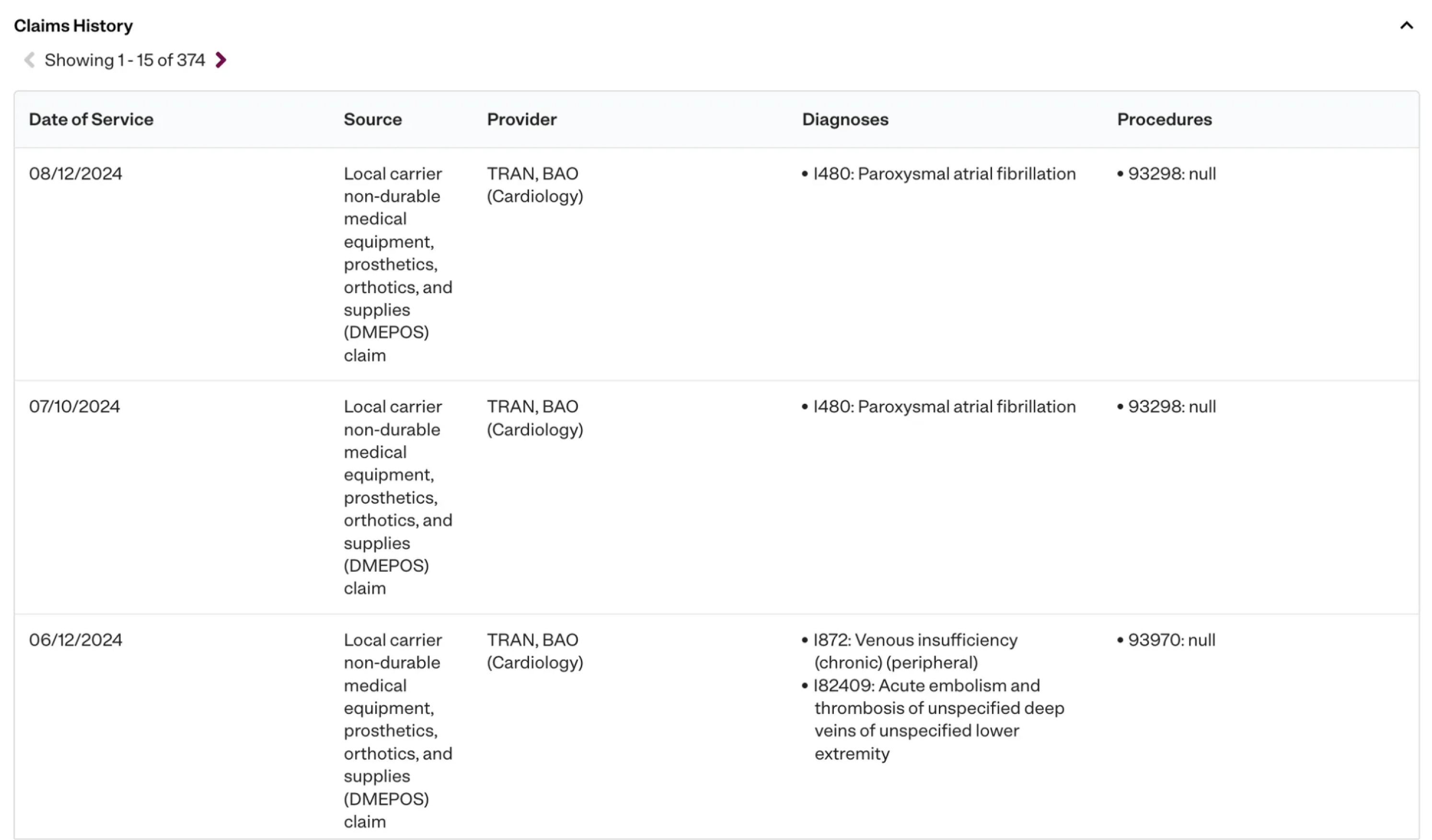
Second, patient information needs to be easily digestible. Information is often dense and hard to read. For example, users often reference the claims history to understand the patient's health and recent provider visits, but the history is long and hard to skim.
When care managers don't have easy access to easy-to-read data, they'll spend a lot of time trying to find and understand the patient's information—often information patients have already given to their providers. This leads to inefficient care managers and frustrated patients, who have to repeat the same information about themselves to different healthcare providers.
Every time I call a new patient, I usually spend 40-45 minutes reading their records in different applications so I can understand their history.— Pathways user
Fixing data gaps would require a lot of collaboration with Astrana's data department, so my PM and I decided we'd save that for a future iteration. However, I could still do a lot to make patient data more accessible and more digestible.
Improvements in the redesign
Simplify the patient profile's visual design for ease of reading
The patient profile was pretty chaotic to look at, so I redesigned it to be more visually consistent.
- Reduce the number of colors. The patient profile was very distracting due to an excessive number of bright colors.
- Clearly separate each section with borders, tables, and accordions, making it easier for users to find the section they needed.
- Decrease the overall number of columns. While I didn't want users to spend forever scrolling through the patient profile to find the information they needed, I was willing to increase the scrolling in exchange for not cramming five columns of contacts into one row.
Note from Caroline
At the time, we were also going through an app-level UI reskin, hence the more black-and-white color scheme and the change in font.
Make the most important information always available
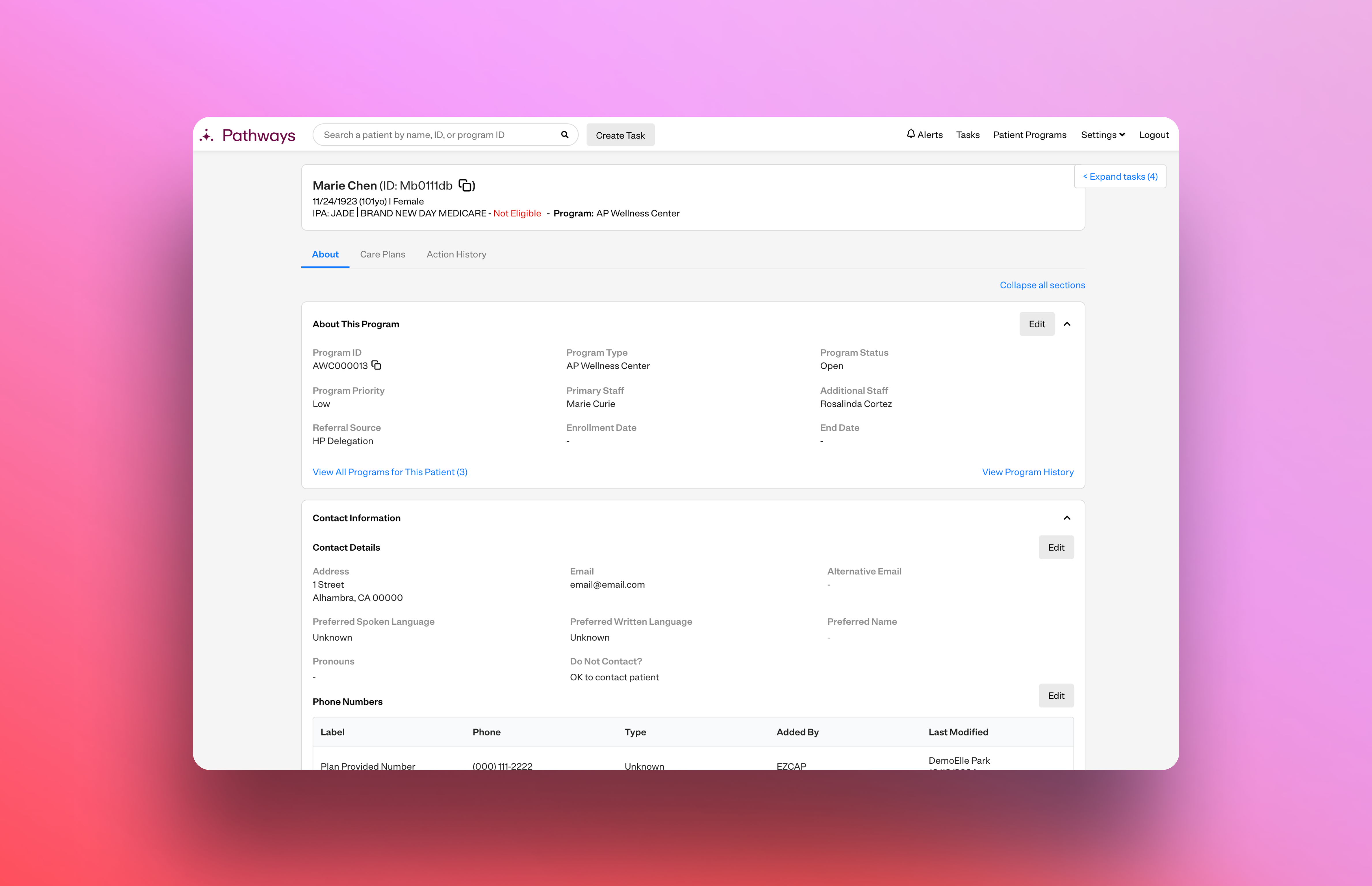
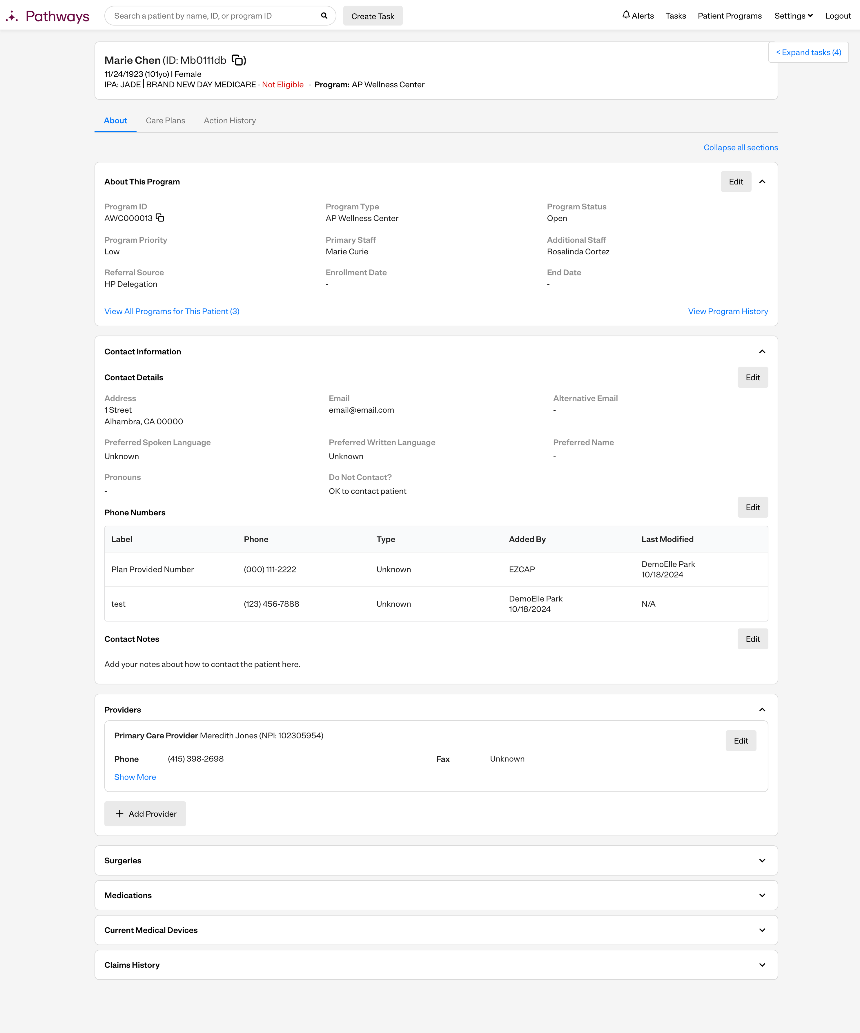
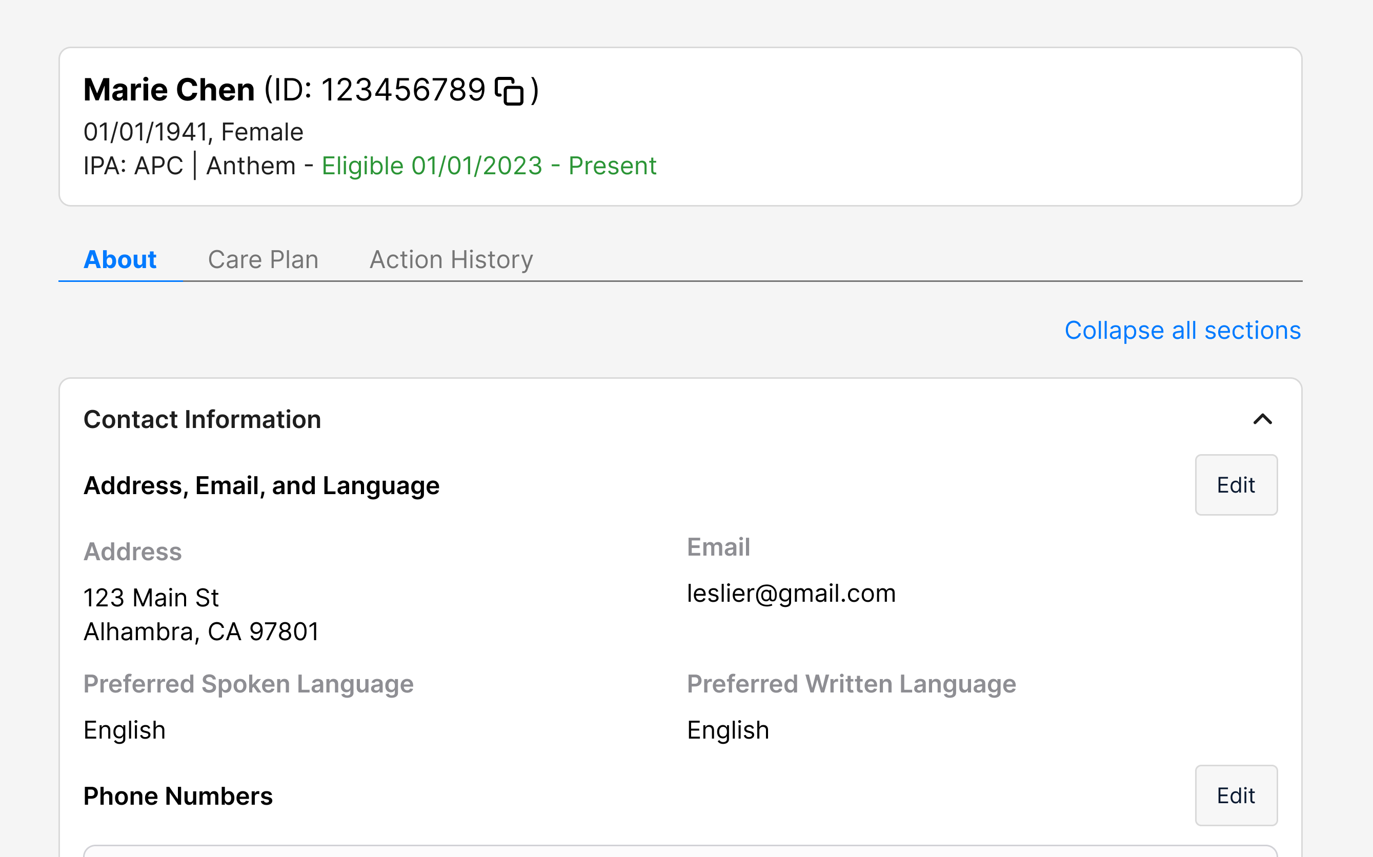
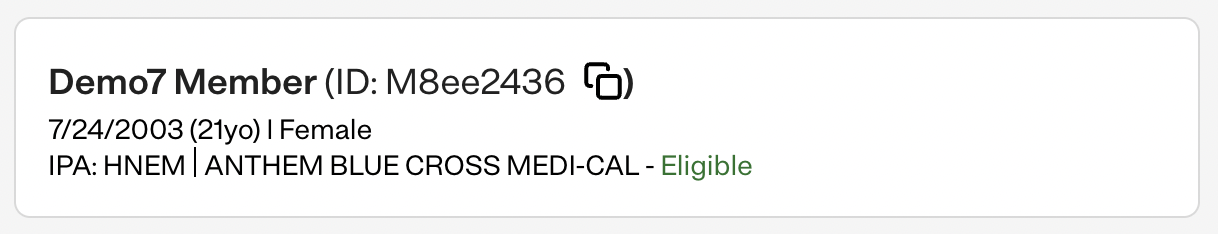
I moved the patient's key demographic info (name, date of birth, gender, health plan, IPA, and health plan eligibility) into an header above the three tabs of the patient profile. This way, users could reference that info while working on the patient, such as editing their care plan or documenting a call.
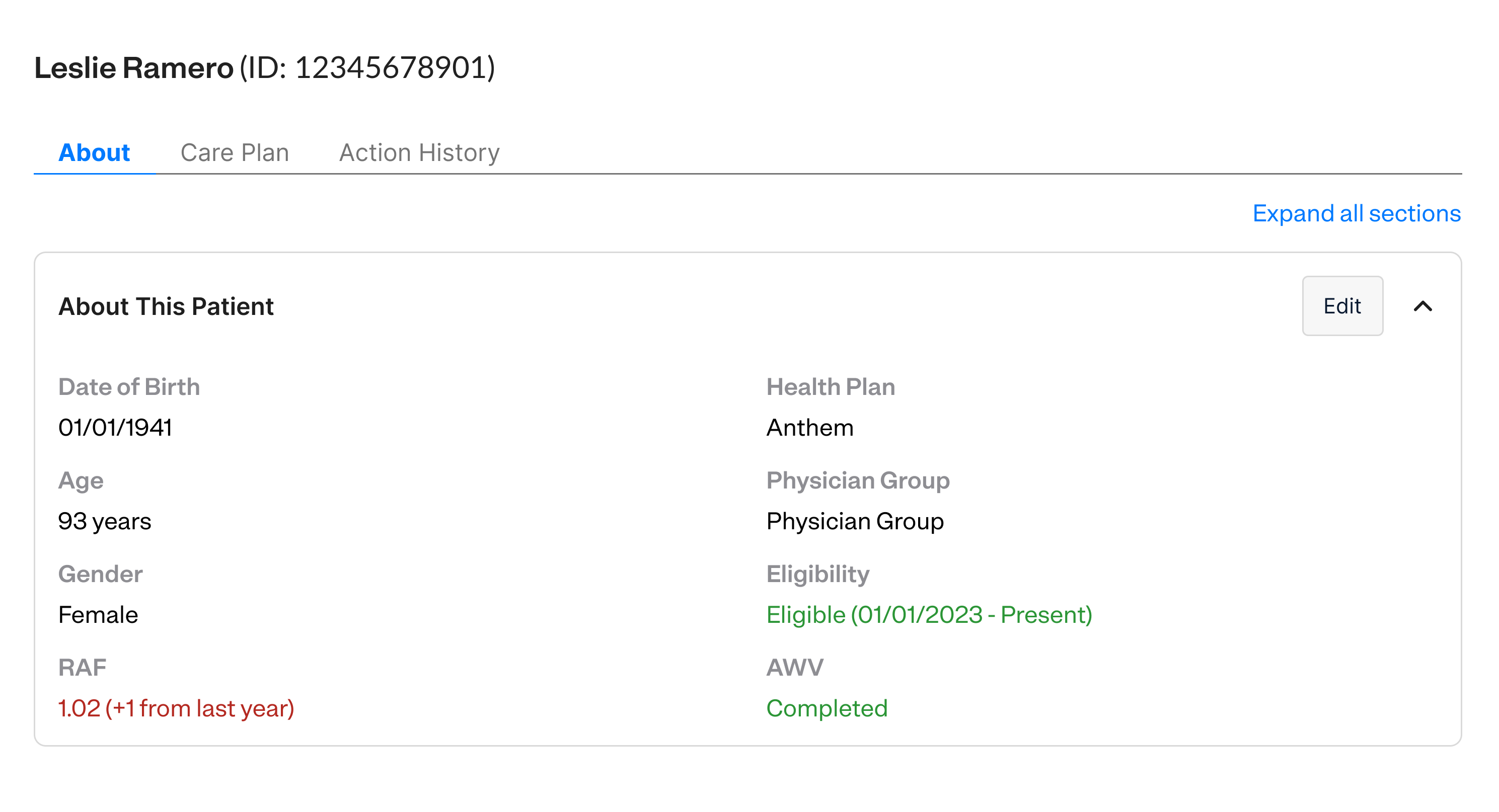
Users found this so much more convenient that they've since requested to have it be fixed on scroll as well.
Allow care managers to update contact information
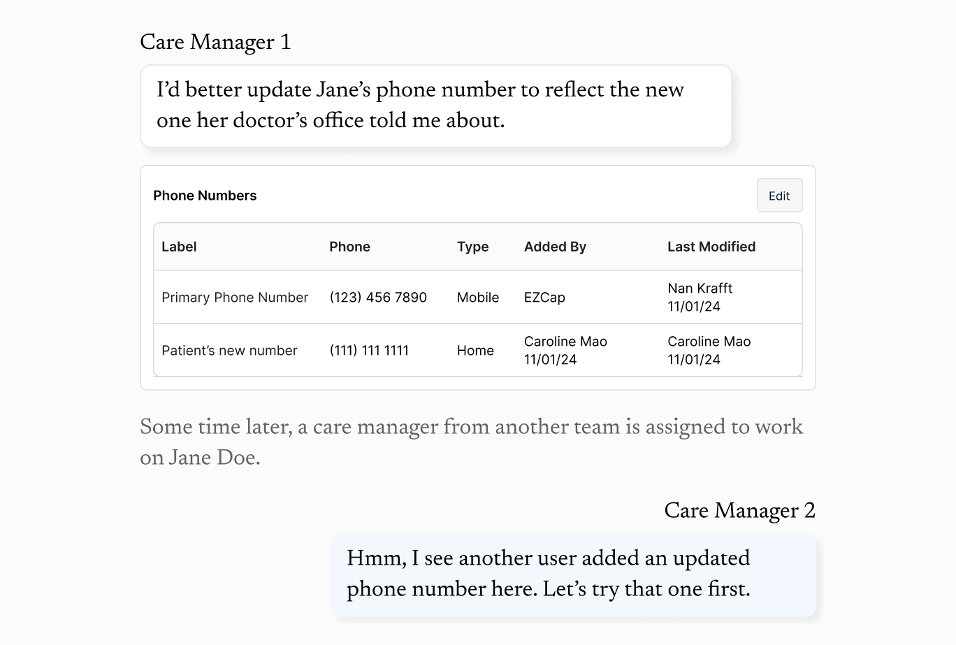
One of the biggest pain points users face is that contact info frequently goes out of date—a patient moves addresses, changes their number, etc., and then they have to check various different apps and call the patient's doctor for up-to-date info.
Add an up-to-date phone number
Users can add an up-to-date phone number to the patient profile so if one user finds one, then others will see it, saving them the work of needing to find it themselves.
Edit other information in the contact section
Users can edit contact information like the patient's preferred languages or notes on how to contact the patient (e.g. if they need an interpreter, are only available certain days of the week, etc.)
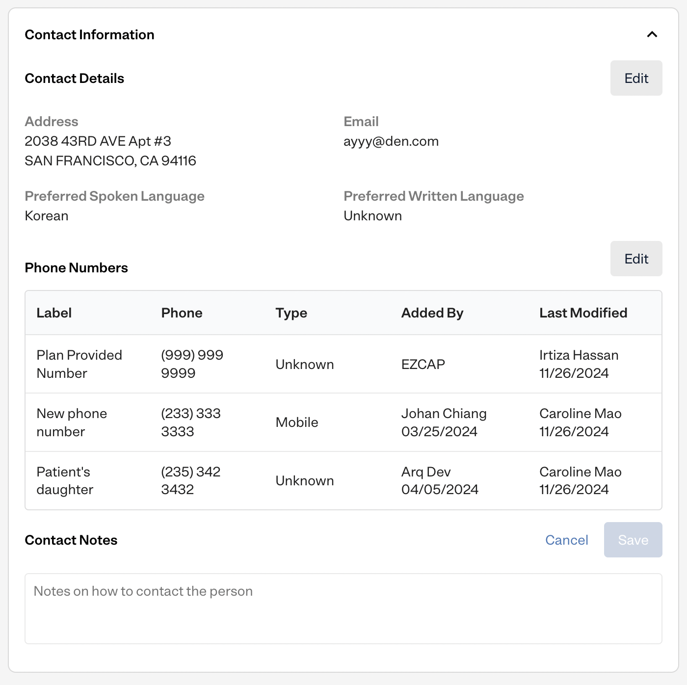
Add contact info for providers
Care management also requires a lot of coordination among the patient's associates, particularly their providers. Besides phone numbers, I saw that users often needed to add other types of contact information for healthcare providers, like an address or fax.
Using accordion sections to improve navigability
I divided the patient profile into sections so it would be easy and scalable to add more information in the future. I explored a couple different options for how these sections could initially appear to the user.
Option 1
The most important sections (demographic and contact info) were expanded by default, and the other sections were collapsed.
Option 2
Each section was "semi-expanded," so you could see some of their content, but longer sections had a "Show More button."
Option 3
Make the patient profile shorter by separating it into two tabs, "About" (demographic/contact info) and "Clinical Info" (medical info).
During my user research, users noted they used some sections much more than others, so I chose to go with Option #1 and leave the most-used sections as open by default. It's easy to quickly navigate and skim for the sections the users were searching for, while minimizing clicks by expanding the most-used sections by default.
The Expand all sections button ensured users wouldn't need to click each accordion one-by-one to expand them unless they wanted to.
Ever since the patient profile was changed to use accordions, it's been much easier to find what we need.— Pathways user
Enhance the readability of the claims
Claims is a user's main source of medical info in the Pathways patient profile, but the table format is hard to quickly skim and read. To determine a patient's medical conditions, care managers are left scrolling through lists of provider visits, trying to extrapolate from the diagnosis codes and procedures conducted.
I redesigned the claims as a chronological feed, hiding less relevant information under a "Show More."
A few smaller improvements
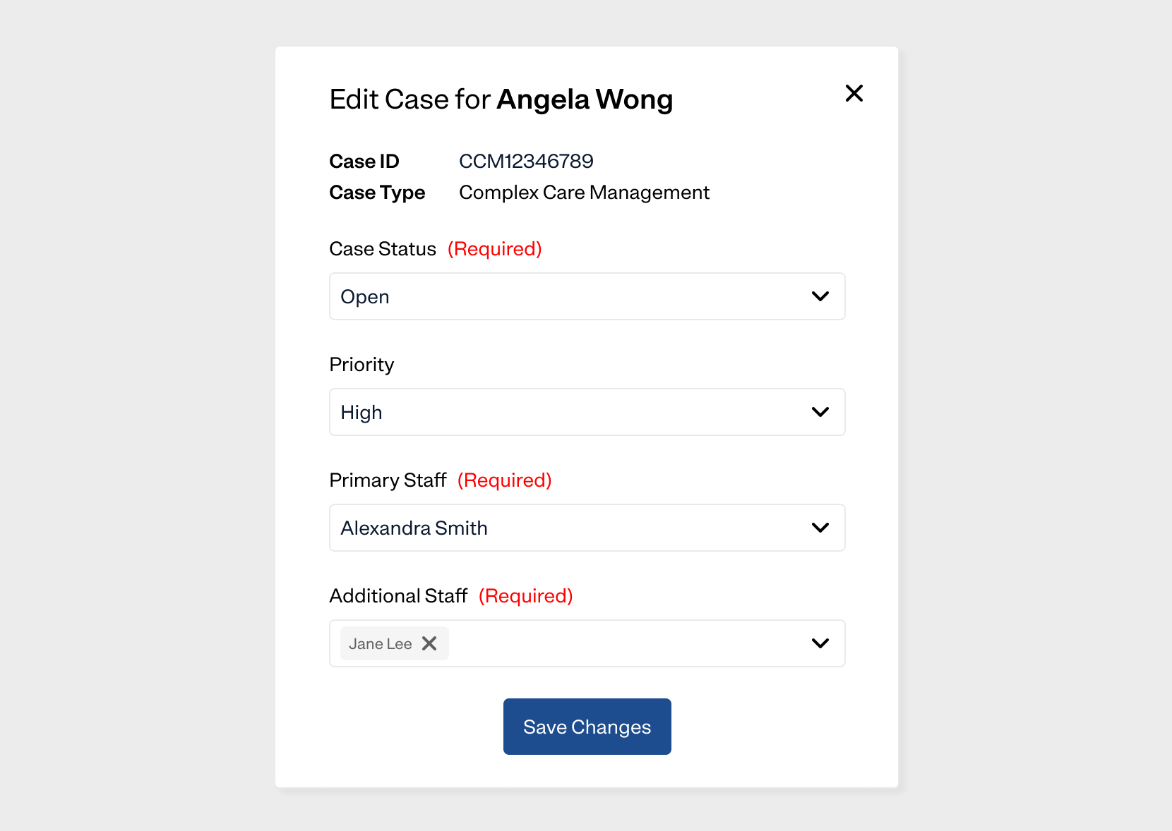
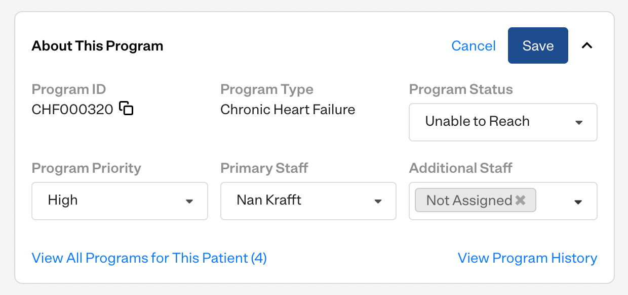
Moving from editing a patient's program information in a popup to inline. This was more consistent with the inline editing pattern in the rest of the patient profile and better UX, since it didn't block out information on the rest of the screen.
The popup [to edit a patient's program] is okay, but I click it many times a day, which gets a little tiring.— Pathways user
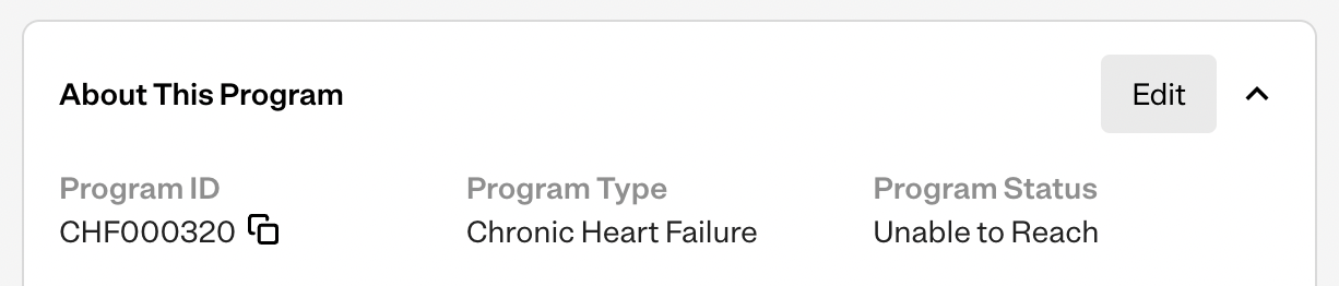
Copy to clipboard buttons for commonly copied information. I added these buttons next to the patient ID and program ID, since users frequently copy them.
Upcoming improvements
Some improvements the Pathways team has in the works for the future.
LLM summarization of the patient's medical history. To reduce the time spent reading claims, we're working on a LLM summary section of the profile users can read to get up to speed.

Autofilling patient's medical data. We want to improve the Pathways data pipeline so we can automatically fill in info like the patient's providers and medications without requiring users to manually add it. The developers are currently working on a GraphQL API for this purpose.
Changing the claims history into a comprehensive care timeline. Rather than separating info like surgeries, hospital discharges, and claims into separate sections (which is the status quo because they all come from different data sources), the patient profile would have a comprehensive timeline that combines all of this information into an easily digestible format that can be filtered and sorted as necessary. This is also reliant on being able to pull in this data.
Final result
Successes
- Easier to find, more complete patient information allowed users to contact the patient quickly, increasing our patient engagement.
- A cleaner, more visually consistent UI with clear sections made it easier for users to find the information they needed and engage the patient with sufficient amounts of context about their history.
- Finally, my user research into the profile helped me glean a lot of insights into how we can improve our data quality. Data gaps are a common healthcare problem, and I'm hopeful my research will help us improve our data in the future.
 Password Protected
I've password-protected this case study to maintain confidentiality. If you'd like to continue reading it, please enter the password (which can be found on my resume) or contact me!