Writing Stationery in the Digital World
Whenever I draw on my iPad, I miss texture. I’ve always loved oil painting for this reason: its sprawling volume, the space it insists on taking up on the canvas, its stubborn refusal to dry. Unfortunately, oil painting in a Manhattan studio apartment is a bit inconvenient thanks to the setup and cleanup required, so for now, I scroll through brushes on Procreate and daydream about color mixing.
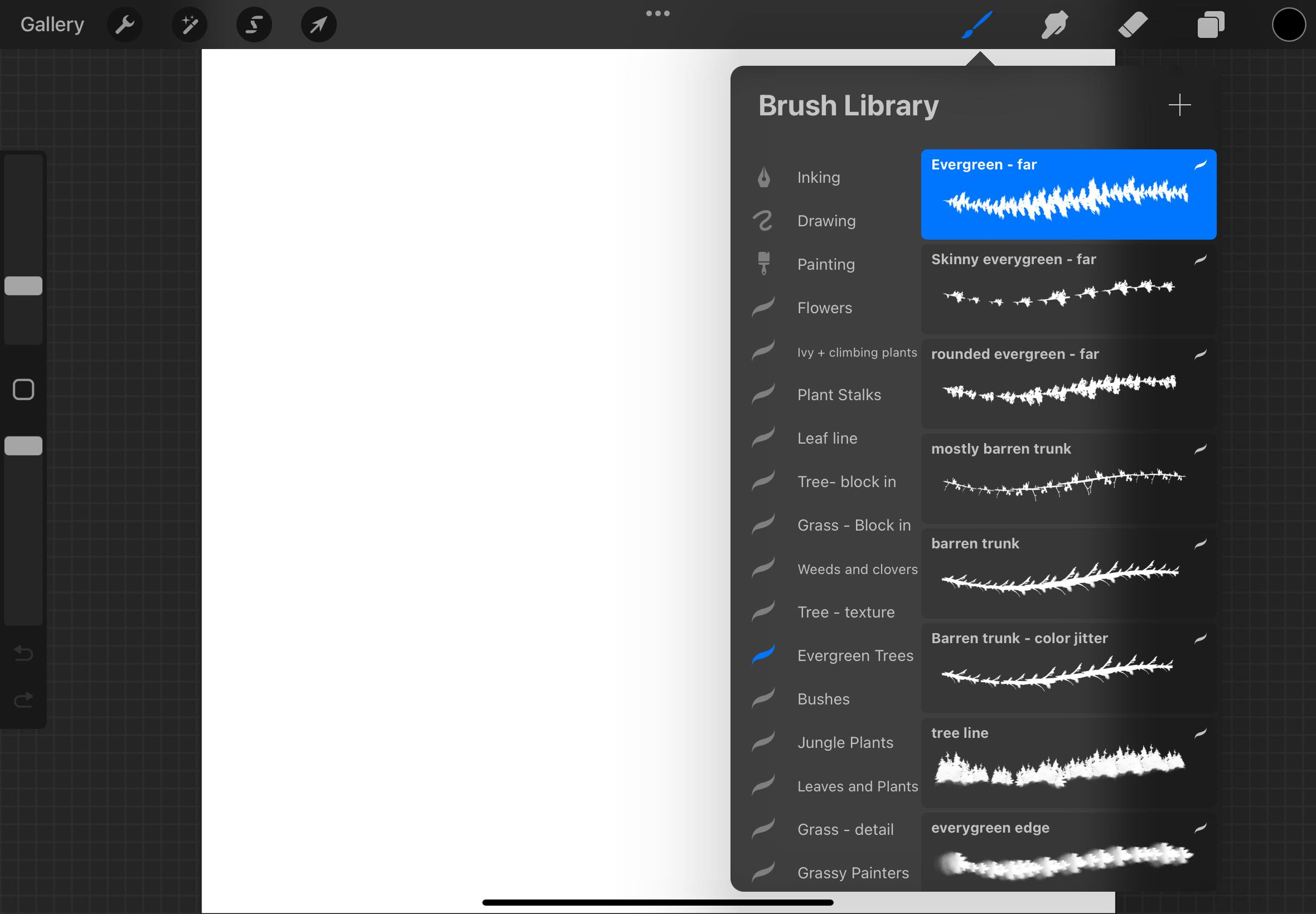
I’ll never get bored of my Procreate brush packs. I own brushes for painting, drawing, and inking. Brushes for different textures. Brushes that imitate foliage, stars, and water. I have so many brushes for different leaves and plants that I could draw a forest with them alone.
Procreate brushes are a little more inventive and diverse than typical writing software, which prefers to use physical writing utensils as metaphors. Like how trash cans indicate deletion and floppy disks indicate saving (though they’re all just social constructs we’ve agreed to), a pen or pencil on a writing application is an indication we can write on the screen. By “writing,” I mean very literally that you can make a gesture with your stylus or mouse or trackpad, and whatever appears on the screen will mirror that gesture.
So far, my main handwriting app, Notability, is not interested in a utensil whose marks are in the shape of ivy vines. This is fair, since Notability aims to emulate handwriting, not ivy vines. However, I was a bit disappointed when one of their updates removed the ability to customize your pen’s stroke width, giving you only three options.
I get the ethos of it. Simplicity reduces decision fatigue. It’s the same reason Notion only lets you choose three fonts: so you can’t spend ten minutes scrolling through fonts before you begin writing, which is a common experience in Microsoft Word. Still, I rather enjoyed being finicky about these things. In real life, you can control your pen’s writing thickness easily: just press harder.
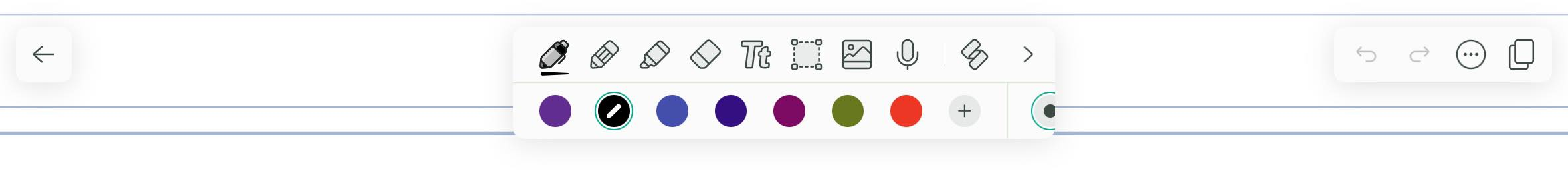
It’s interesting to consider which writing tools get to be metaphors in software, and which don’t. Notability offers you four main options: a pen, a pencil, a highlighter, and an eraser. They all have a few different custom settings, like the color and whether there’s variable stroke width. They also have a laser, tape, and ruler, which I will at some point figure out the uses of.
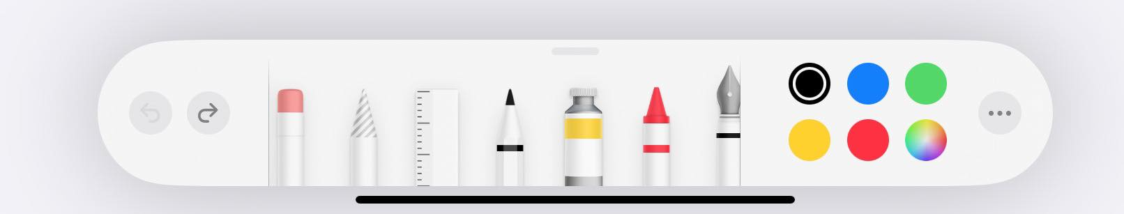
The iOS tools on Markup/Freeform offer a few more options: a fountain pen, a crayon, an eraser, a ruler, markers with tips that have varying degrees of thickness, and a lasso fill tool that fills in the lines you draw. I had no idea what the lasso fill tool was—it looks like a cross between a marker and a can of spray paint—so I had to Google it to find out what it’s called. The digital drawing apps Clip Studio and Krita both have similarly named features, though, so it’s not an entirely new pattern.
The fountain pen fascinates me the most. As a casual fountain pen enthusiast (I own a Pilot Kakuno), there’s a few appeals to the fountain pen for me:
- The tactility. It glides smoothly and easily over paper. I have a screen protector over my iPad, but it will never measure up to the wild and wonderful world of all the different types of paper out there.
- The sustainability. There’s less waste, since you can refill it with more ink instead of purchasing new pens. Fountain pens are also durable and unlikely to break, and you can get them repaired if they’re damaged.
- The ability to change out your ink color, including adding glitter inks. If anyone at Notability is reading this, I am begging you to please add a glitter ink color option.
Most of these aren’t particularly applicable in the digital medium, so I wonder why there’s a fountain pen feature at all. It doesn’t actually remind me much of my fountain pen. But I’m a bit charmed that someone wanted to add it to iOS anyway.
I enjoy the more unorthodox applications of stationery-related metaphors as well. Take, for example, the washi tape feature FigJam added for their 2022 April Fun Day:
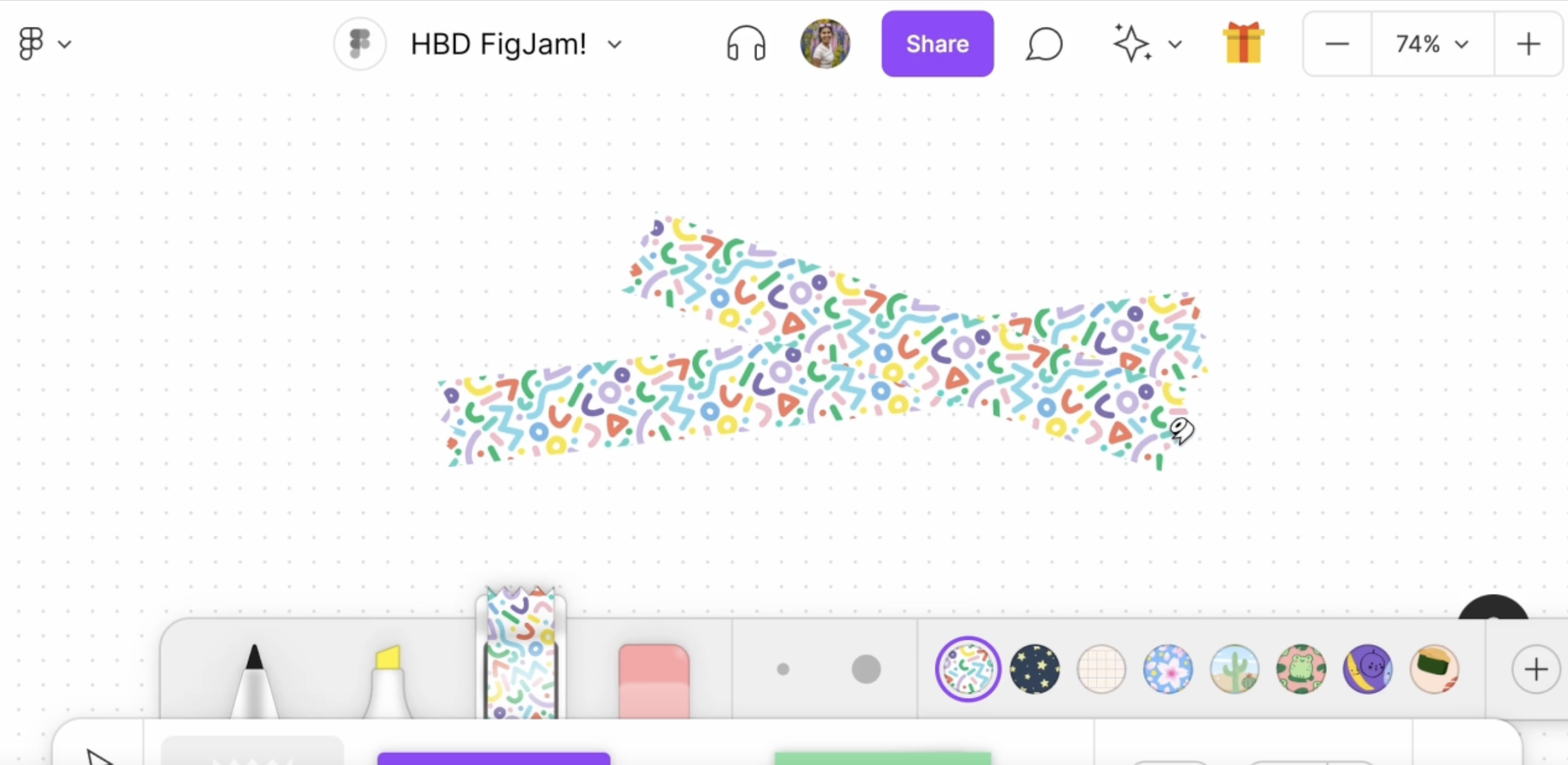
Maybe not as practical as a pen, but it’s a cute (and very optional) way to inject some fun into your diagrams, along with FigJam’s other sticker options. Because creating things is fun!
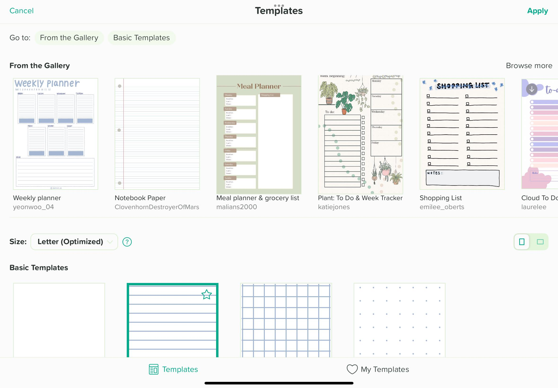
Notability has simple templates for lined, grid, and dotted paper. Their gallery also offers an array of custom templates made by community members, which really do appeal to the teenage girl in me who was obsessed with cute planners, Stabilo fineliners, and color coding their notes. (Nowadays, I prefer a mix of Google Tasks and haphazardly scrawled notes in Notability.)
It’s important to note that many of these cute, fun, incredibly diverse options wouldn’t be available without the community of people who use this software. Procreate offers some great basic brushes, but I downloaded most of mine from brushmakers on the Internet. (Shoutout in particular to Wendy Xu’s comic brushes set, Amanda’s Pencil Box set, Maxine Vee’s brushes, and MaxPack brushes.) Notability templates are mostly made by Notability users. The idea of digital washi tape came from a tweet by designer May-Li Khoe.
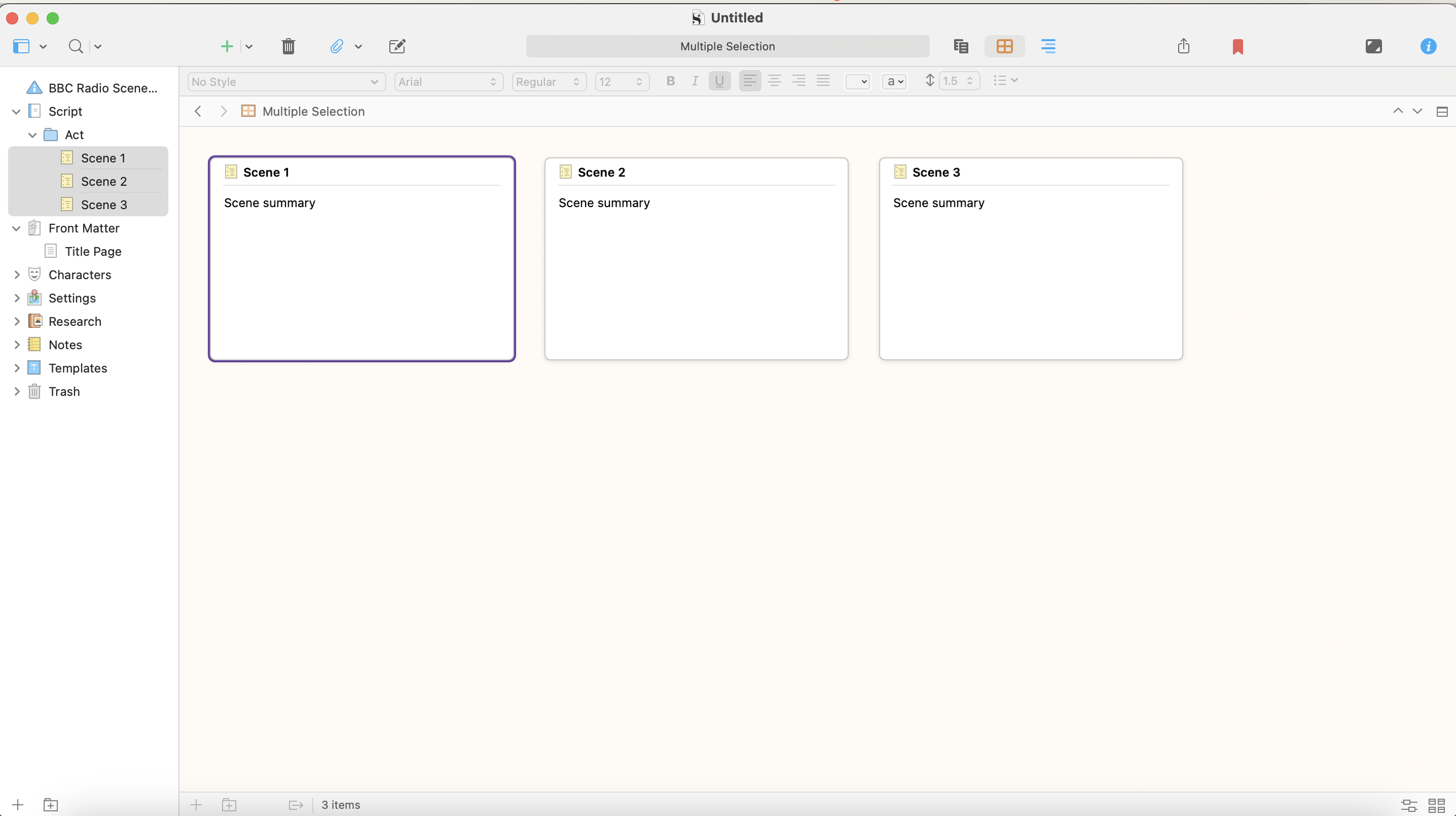
I would be remiss to conclude this article without mentioning Scrivener, which is the writing app love of my life. Scrivener is Very Serious Writing Software. It does not have cute stickers or washi tape, but it doesn’t feel corporate or sterile either. It feels exquisitely writerly. I could and at some point probably will write an essay on why I love Scrivener, but there’s two relevant features here.
One is a corkboard view where each notecard represents your summary of each scene in your file. Of course, you could just do this in Notion’s gallery view. But it’s cute that it looks like a corkboard, and you can quickly switch back to the editor for whatever scene you’re currently working on.
The other feature is typewriter scroll: when you write, the line you’re working on stays at a fixed position on your screen, much like a real typewriter. It’s one of those special Scrivener features that makes me think, “Wow, this was designed by people who spent a lot of time thinking about how people write.”
As much as I enjoy them, I don’t think these sorts of features will ever necessarily measure up to the real, physical thing, nor should they have to. No amount of digital glitter ink or washi tape or templates that match the exact style of a Hobonichi planner will convince me I am, for instance, actually using a Hobonichi planner. Some of these features outlast their physical counterparts: the decrease in typewriter usage, for example, or the classic “wait, that’s a floppy disk?” reaction to the save icon. I’d be interested to see some new metaphors; we don’t have to restrict ourselves to our current ones or use only analogues of what exists in the real world at all.