Very First Design Tools (Or, Where Children Designed)
Julie Zhuo’s first design application as a child was MS Paint. She mentions on an episode of Lenny Rachitsky’s podcast that as an artistically inclined but resource-limited teenager, she pirated a copy of Photoshop because she couldn’t afford the real thing. It’s a story many designers can relate to. My first UI design tool—pirated back in the pre-Figma days when it hadn’t been as standard to produce glossy, pixel-perfect, Dribbblised mockups—was a not-very-functional copy of Sketch. (In Sketch’s defense, my copy was probably not very functional because it was pirated.)
Of course, I’m still relatively young, and even Sketch hasn’t always been around. A mentor of mine once mentioned that his first design job was not actual designing, but manually doing pixel measurements of interface elements in Photoshop so he could send the specs to developers. I’m glad design tools have advanced significantly since that time.
But this is not a “real ’90s designers remember” post or a history of early design tools. It is about our very, very first design tools, before we became aware we were designers, that this was a role people had, or that as another former teenage Photoshop pirate Maggie Appleton put it, before the realization you could get paid for it.
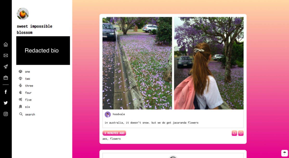
My very first design tool (VFDT)—before even my Sketch days—was not a mockup tool at all, but the Tumblr code editor. It’s tragic how the Tumblr thememaking community has since declined thanks to a number of moves from Tumblr staff, including making it possible to view blogs without leaving your dashboard, which has rendered custom themes unnecessary. In 2013, the Tumblr thememaking community was a vibrant, colorful, and yes, messy, place to be. It was where I learned—from w3schools tutorials, fellow teenagers, and a lot of trial and error and constantly clicking “Preview Changes” in the Tumblr code editor—to write the HTML/CSS/JavaScript that got my blog to look how I wanted it be.
I wasn’t thinking about being a #WomanInSTEM or trying to make money or following UX principles. I had never even heard of the terms “user experience” or “front-end development.” I was just a kid who really liked adding gradient hover effects to the links on their blog, and the Tumblr code editor offered me a way to do it.

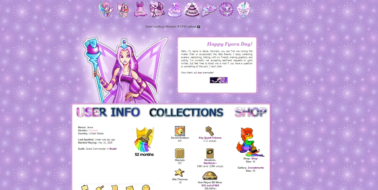
Tumblr was that Very First Design Tool for several people I know who have since grown up to be professional designers and developers. Photoshop was another example of a common VFDT. So was Neopets. An older Tumblr thememaker once mentioned that before she started coding on Tumblr in her late teens, she’d written HTML/CSS as a child to customize her Neopets page.

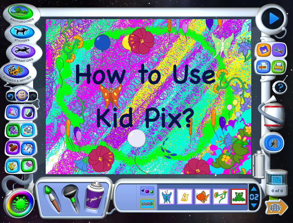
KidPix, which Jess Wang described as “an amazing design tool,” was another VFDT. A WePresent interview with KidPix’s creator, Craig Hickman, describes KidPix as the following:
Imagine a really intuitive, happy version of Microsoft Paint, or a very cheerful, funny version of Adobe Illustrator. You could draw, paint, stamp, blob, drip, mush, spray paint all over the window’s canvas. If you didn’t like what you drew you could explode the whole thing with a stick of dynamite. The noises, colours, shapes and usability encouraged the reckless creative freedom that only childhood allows.
Though I have only hazy memories of using KidPix on the school computers in my elementary days, I’m fascinated by the concept of a VFDT explicitly intended to enable children’s creativity. It wasn’t meant to mock up Dribbble-ready screens with perfect developer specs. It was a children’s tool meant to make creating things fun.

I’m particularly fascinated by what Hickman had to say about designing for kids:
I think when people are designing for children they think children want to be entertained and they do things like put characters in and be ‘entertaining,’ but actually, the child is the artist, they’re the ones who want to do the entertaining, they’re the ones making something. In the end, whatever’s on the screen should be about what they’re doing, what they make, not about what is around it that looks cool.